Rolf P. Harder – A Pioneer of Canadian Graphic Design
An aficionado of the history of modern graphic design explores the archives of Rolf P. Harder
June 6, 2024
Several years ago, the McCord Stewart Museum acquired, through Mrs. Carina Marinelli, responsible for honorary members and archives at the Société des designers graphiques du Québec (SDGQ), the archives of five pioneers of graphic design who left their mark on Montreal’s visual identity in the latter half of the 20th century: Rolf P. Harder, Georges Huel, Roger Lafortune, Gilles Robert and Réal Séguin. These five fonds, which were processed with the help of a grant from the BAnQ, may now be consulted in the Museum’s Archives and Documentation Centre. To commemorate the occasion, we asked graphic designer Bryan-K. Lamonde to look through one of them.
| See the Rolf Harder Fonds on the Online Collections! |
Back in January, the McCord Stewart Museum invited me to explore the archives of graphic designer Rolf P. Harder. As an aficionado of the history of modern graphic design—in particular our rich Canadian visual heritage—I was very pleased to be given the opportunity to delve into the sketches and lesser-known works of a designer that I greatly admire. Revisiting our design history gives us perspective on past events as it reveals nuances that are often more perceptible through the prism of visuals.
I therefore truly enjoyed losing myself in these archives at the Museum’s Archives and Documentation Centre, exploring them at my own pace and pursuing topics that piqued my interest. I would like to share some of these moments of discovery and observation.
PIONEERS OF CANADIAN GRAPHIC DESIGN
The Canadian graphic design scene was enriched by the arrival of many top-tier artists from Europe long before milestone events like Expo 67 and the 1976 Olympic Games. Designers like Harder and Ernst Roch, who both moved to Canada in the 1950s, played an important role in developing the country’s graphic arts sector before these landmark occasions generated international attention. They were joined by other leading figures of the day, some from abroad, like Fritz Gottschalk, as well as local talents like Georges Huel, Raymond Bellemare and Réal Séguin.

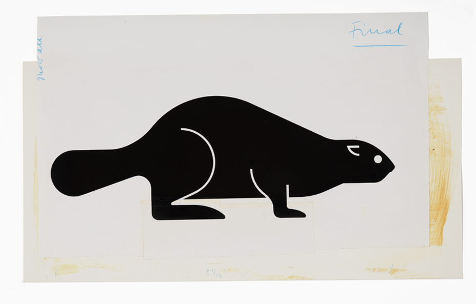
The International (or Swiss) Style, a major design trend, first appeared in Canada during this effervescent period, and went on to profoundly alter the country’s graphic landscape. Developed in Switzerland in the 1950s and often associated with the post-war reconstruction of Europe, the movement is known for its humanist, universal, rational approach. Influential designers like Armin Hofmann, Josef Müller-Brockmann and Emil Ruder were key to its development. Characterized by a spare, geometric, typographical aesthetic, the style also prioritizes a creative approach focussed on clear, concise visuals, which is precisely what we find in the work of Harder.
| The origins of modern graphic design in Quebec The first signs of modernism appeared in the field of poster design well before Expo 67. |
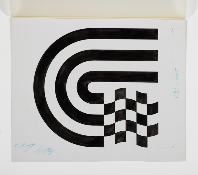
Going through the archives, I had the chance to study early drafts and different versions of his landmark projects, such as the iconic symbol of the 1977 Canadian Grand Prix. It was fascinating to see the sketches, pencil studies and layouts proposed for the project. The very manual aspect of this process clearly demonstrates the technological limitations of the time and reveals how some suggestions evolved from these technical constraints.
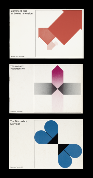
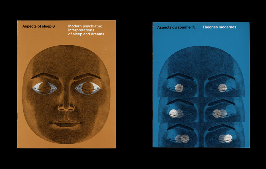
THE PHARMACEUTICAL INDUSTRY AS A SOURCE OF CREATIVITY
A total revelation for me was discovering the scope and finesse of Harder’s work for the pharmaceutical sector. Although today this field is often thought of as strictly commercial and devoid of creativity, the work produced by the German-born designer is the antithesis of this.
Rolf Harder worked on many projects with Swiss multinational Roche, a leader in Montreal’s pharmaceutical industry at the time. Using various media, he designed a variety of products from packaging to information catalogues.
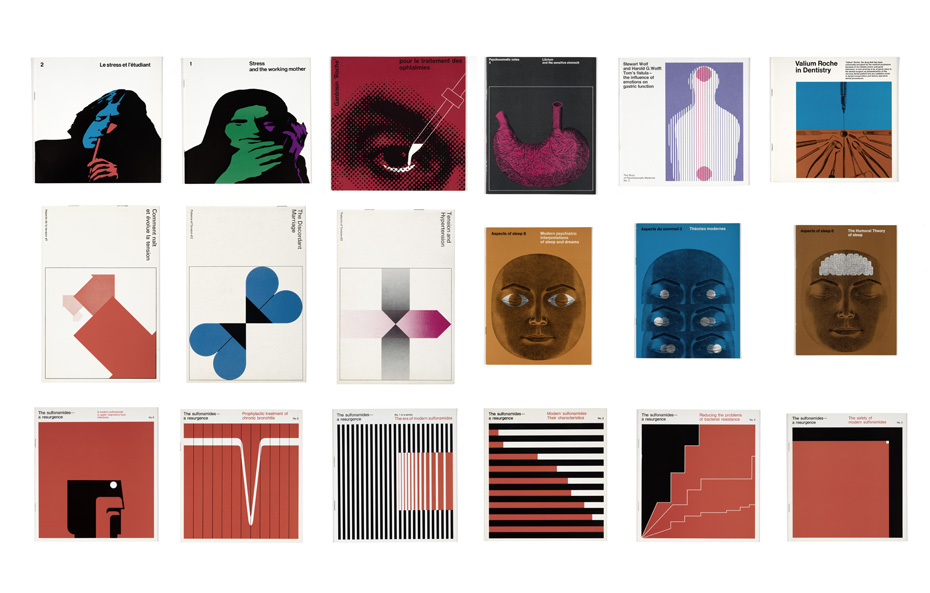
What really fascinated me about these documents was the unobtrusiveness of the Roche logo. Companies usually prefer their logo to stand out from any surrounding text. In the designs that I saw, it elegantly blends into simple, bold compositions that concisely and effectively communicate the message and explain the products. Exhibiting a freedom and a variety of graphics alternating between photography and illustration, the designs also employ vivid colours to help create a powerful graphic presence. Harder used these visual elements to delineate the various types of Roche products, framing everything with a clear, well-organized, easy-to-read typography. The overall effect is dynamic, while the ingenious use of white space masterfully and elegantly lets the composition breathe.
COMPUTERS AND THE TRANSFORMATION OF THE DESIGNER'S WORK
Graphic design experienced a major transformation with the arrival of computers in the 1980s. Although Harder was recognized for his simple, geometrical approach, it is interesting to note how computers affected his work. I imagine it was highly tempting to explore the various features of these brand-new tools. At this time, the designer’s practice was influenced by what software could contribute to his designs, which sometimes led to a form of visual complexity that I had not yet seen in his archives. This included trends like digital visual effects, the presence of perspective grids representing cyberspace, and typographic hierarchies that were less structured than usual. However, far from being the rule, these proposals were the exception. Many of his projects from the 1980s and 1990s remain simple and timeless, like the rest of his work.
ARCHIVES TO INSPIRE THE NEXT GENERATION
For the past several years, mass-market graphic design in Quebec has been slowly returning to a simpler, more direct style. Our overexposure to visual stimuli is encouraging designers to opt for much simpler solutions to counter all the noise.
In short, it was fascinating to look through these archives of projects and sketches created several decades ago. Rolf P. Harder’s work is inspiring for graphic designers working today as I feel his creations remain stunningly current and relevant. Obviously, some projects have not aged as well as others but, overall, there is a lot to learn from these designers who built the Canadian and Quebec visual identity. In the studio, we are inspired by this heritage and find ways to reference it in our work. If you are interested in history, there is a way to create that can transcend time.
I would like to express my appreciation to the McCord Stewart Museum for inviting me to peruse Harder’s archives. Timeless, intelligent and artistic, his work continues to resonate today.
About the author

See also