The fascinating relevance of Parachute
Parachute: Subversive Fashion of the '80s—an opportunity for the exhibition's designer and graphic artist to (re)discover the brand.
November 18, 2021
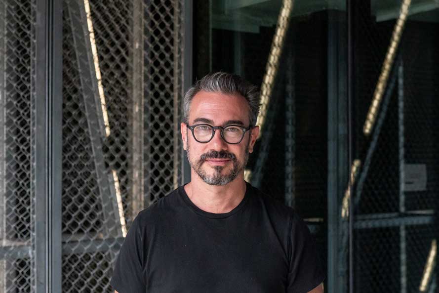
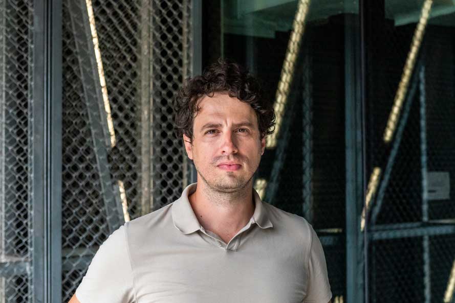
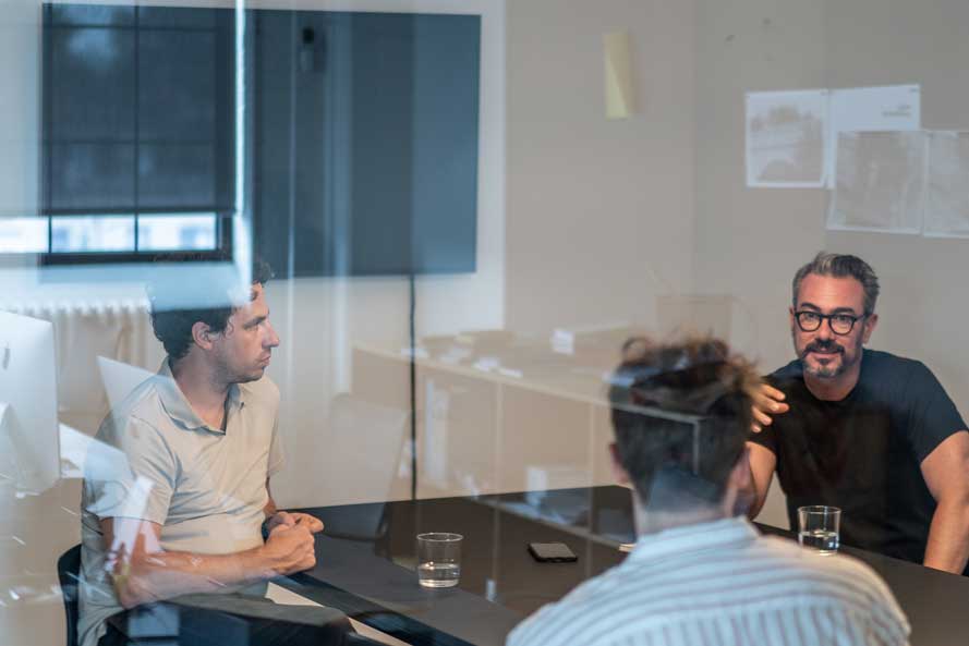
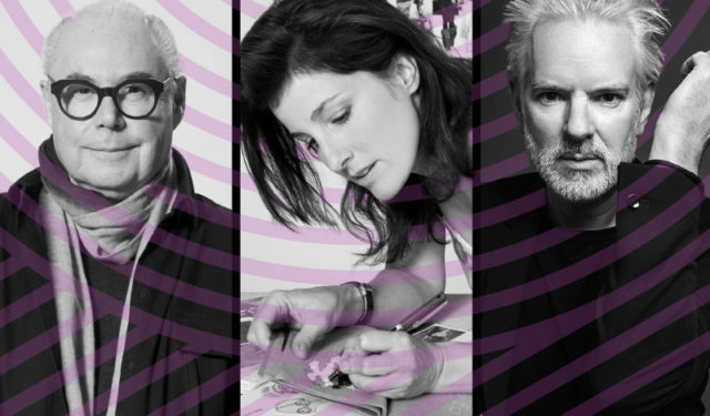
I met with Zébulon Perron and Bryan-K. Lamonde in the industrial building where they both work. They collaborated with the Museum’s team on the design of the exhibition Parachute: Subversive Fashion of the ’80s, Zébulon as exhibition designer and Bryan as graphic artist.
Okay, we’re recording. Thank you for making time for this interview. Let's start by having you introduce yourselves and explain what you do.
Zébulon: I’m the creative director and founder of Atelier Zébulon Perron. We design interior spaces, primarily in the hospitality industry, both in Montreal and some internationally. We generally don’t do private residential projects because our focus has always been on the public sphere. We’re interested in designing spaces that are used by a lot of people.
Bryan: I’m the creative director and co-founder of Principal, a strategic design studio. We essentially do graphic design, but we also have a web development studio. In addition, we do exhibition signage and design, primarily the graphic aspect.
We’ve worked on a lot of exhibitions in Quebec and Canada. Our close connection with the cultural sector is, in some respects, what makes us special. We’ve collaborated with the McCord Museum in the past and were pleased to be asked back to work on Parachute.
How did you react when the Museum approached you to work on the Parachute exhibition?
Zébulon: This is the first time we’ve worked with a museum. Parachute is an iconic Montreal company and we were really honoured that the Museum approached us because it’s a brand we know from our youth. Parachute had an incredible impact back in those days because it came from the underground culture and club scene. There was an underlying fierceness in its approach, as well as a global ethos with its Japanese influences, androgyny, etc. Knowing that, we were really keen to be part of the exhibition. So we immediately said yes!
What did you think when you discovered the Parachute archives?
Bryan: I was not at all familiar with Parachute, but when I saw the archives, I realized it offered something really interesting and rich. It is a perfect example of postmodernism: disruption generates a reaction, and where there is a reaction, there is energy. When I looked at the graphic communications materials with their incredibly assertive visual identity, I was immediately inspired.
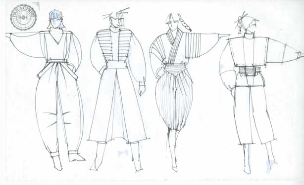
Zébulon: To dive deeper into the subject, we found it helpful to look at old documents and archival photos, including images of the original retail spaces. A lot of inspiration came from the interior design. It was very challenging because there was so much to show, but on the other hand, the project kind of evolved naturally, since the brand identity was already so strong.
Bryan: The fact that Nicola, co-founder of the brand, was part of the project, also helped validate some of our intuitions. We really got a sense of the brand through what she found important.
What were the biggest challenges involved in bringing such a strong vision to life?
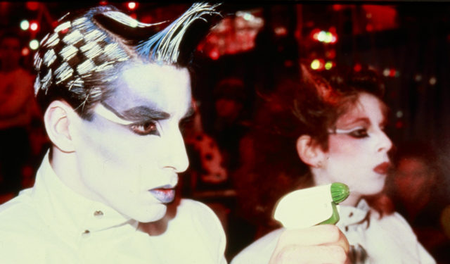
Zébulon: For the exhibition design, we had to present the objects without overdoing it. We had to find a strategy to address the various themes, to contain them spatially so they could be assimilated, but at the same time, we wanted to avoid providing superfluous information. We therefore decided to create individual ‘moments.’ The exhibition is organized more or less chronologically. The introduction, for example, explains the origins of New Wave culture. Having set the stage, we then try to immerse visitors in an atmosphere that recalls the Lime Light, the iconic Montreal disco of the late 1970s, early 1980s.
How were you inspired by the Parachute brand's style? Can you give an example?
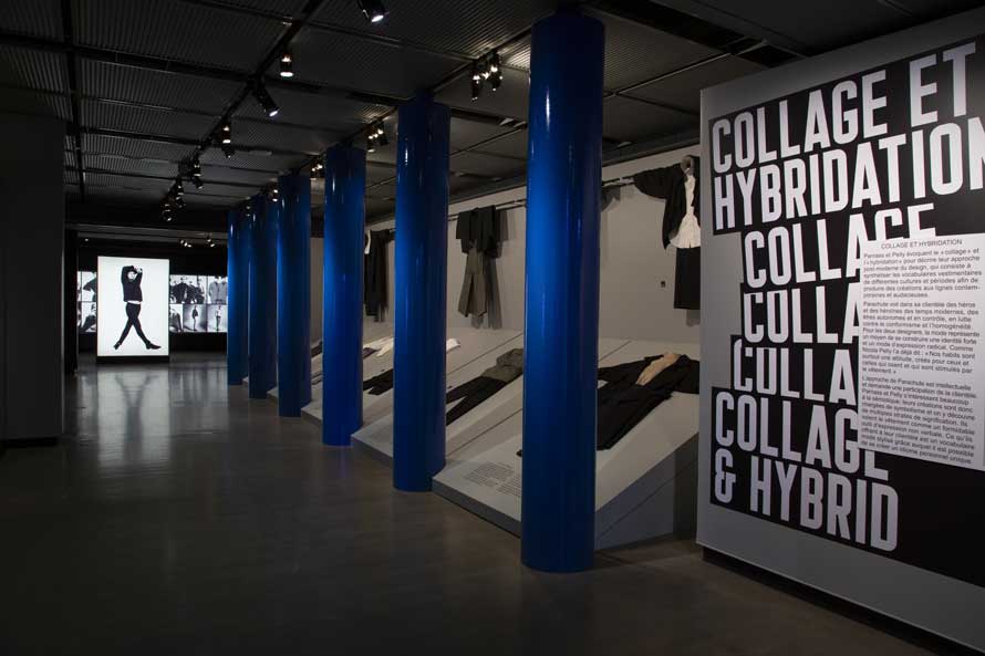
Zébulon: From an architectural standpoint, the Parachute stores had a very ‘do it yourself’ aesthetic so we adopted the same approach. We tried to reuse materials and cleverly incorporate iconic techniques into the exhibition. For example, some of the stores featured columns that were made of cardboard tubes, the kind used to pour foundations. So we decided to include some of those in the exhibition design.
Bryan: When it came to the graphics, we opted for the Arial font, which is usually shunned by graphic designers. However, we were happy to use it because it was designed in the 1980s as a clone of the Helvetica font. It matched the language of the era and was, in some respects, in the same vein as Parachute. It’s like the graphic version of ‘do it yourself.’
How did you incorporate multimedia elements into the exhibition?
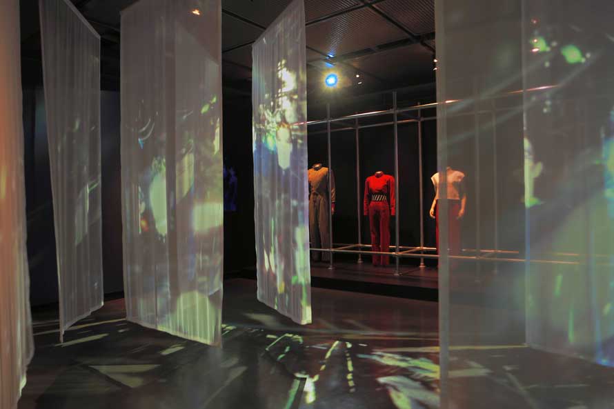
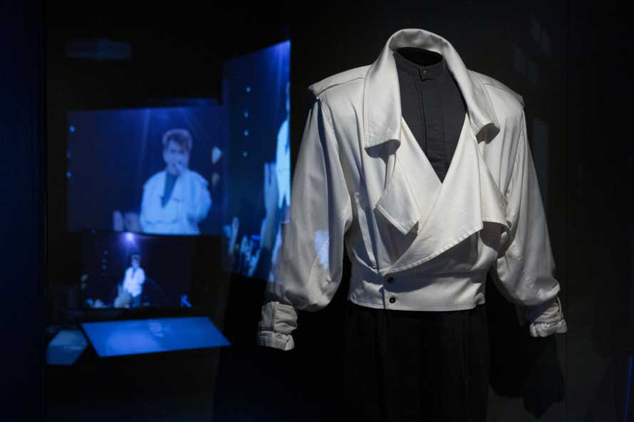
Zébulon: There are images projected onto diaphanous screens to immerse visitors in the atmosphere of the era and a sequence of photos, but on a human scale.
There’s also a section devoted to the influence of popular culture through the MTV channel. I remember watching MTV when I was a teenager, with its in-your-face attitude and saturated aesthetic. So we created an installation with a tower of television sets, a little like Mad Max. This helped convey another aspect of the brand’s influence. After all, Parachute was adopted by popular artists like Duran Duran and Peter Gabriel, along with the TV series Miami Vice. Image making was very important at that time.
Do you have anything to add before we end the interview?
Zébulon: It was a privilege to have a take on this whole era. I hope that we managed to capture it and give people an idea of what it was like. What I really took away from the experience is that it is so contemporary, so timely.
Bryan: The Parachute brand is like a buried treasure that hasn’t aged. If we had unearthed it 10 years ago, things could have been completely different, but today it is super relevant.

