The origins of modern graphic design in Quebec
The first signs of modernism appeared in the field of poster design well before Expo 67.
April 4, 2025
According to popular belief, pre-1970s Quebec advertising design was totally dominated by traditional elements: figurative illustrations, a busy narrative approach, old-fashioned ornamentation and typography, and vague spatial compositions.
This myth, which endures to the present day, derives from the idea that a group of foreign-born graphic designers brought the International Style and ideals of modernism with them when they came to work on Expo 67. However, the true story, which is hard to reconstruct given that so many of those involved have died and their work has disappeared, is more complicated and very different.
The pioneers
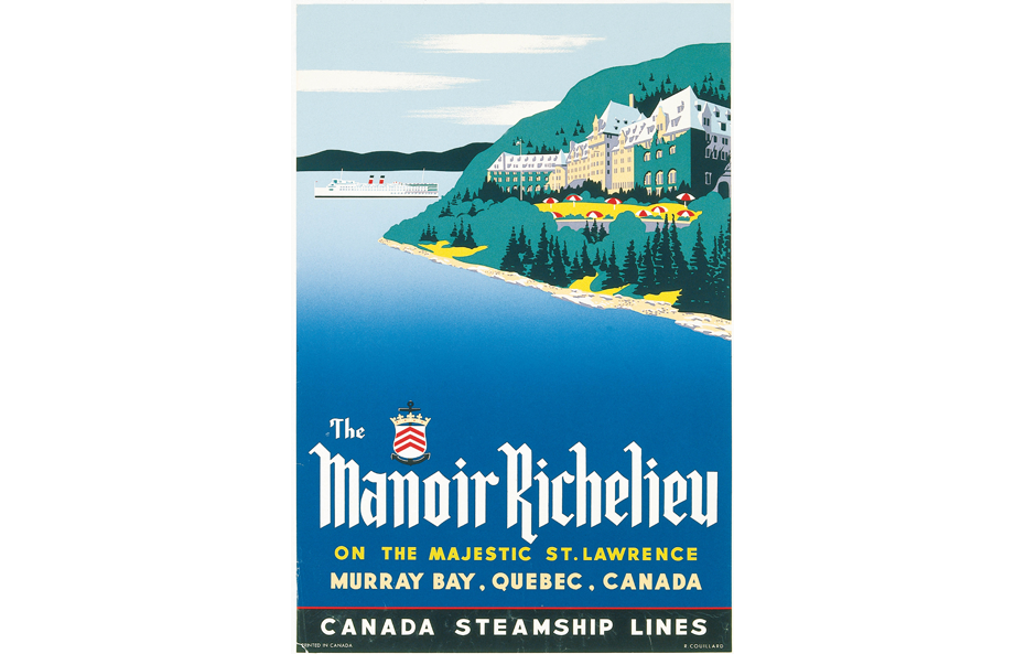
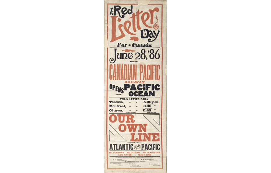
The Canadian Pacific Railway (CPR), a private company incorporated in 1881, and the National Film Board of Canada (NFB), a Crown corporation created in 1939, were behind the first modern posters produced in the 1930s and 1940s.
CP Rail was formed to build a rail link uniting Canada from coast to coast. From its founding, it conducted advertising campaigns using posters, brochures and magazine inserts. It hired dozens of Canadian and foreign-born artists whose graphic designs were printed in thousands of copies and distributed around the world. In the early 1930s, the company opened a silkscreen studio in Montreal’s Windsor Station. This print shop produced most of the posters created by two prolific artists representative of a more modern style—Norman Fraser and Peter Ewart.

Right: Norman Fraser, Romance Route to Europe, 1938, Exporail Collection
Norman Fraser, of whom we know very little except that he lived in Montreal from at least 1930 to 1953, designed numerous posters in a wide variety of styles. They ranged from simple typography posters to the bold modern poster, Play Golf, created in 1939 for the Empress Hotel in Victoria, BC. He also produced posters using photographic elements, like 1938’s Romance Route to Europe, which advertised transatlantic crossings.
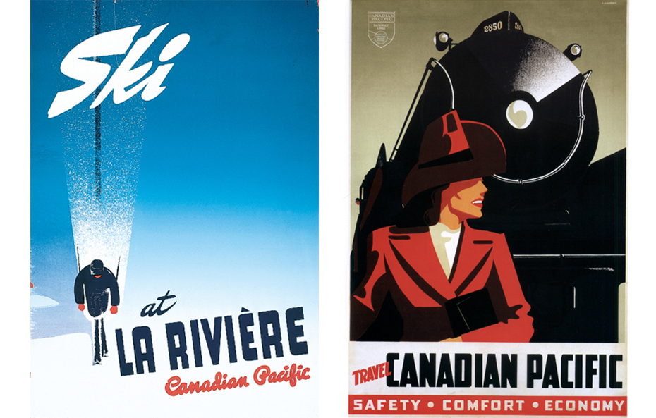
Right: Peter Ewart, Travel Canadian Pacific, 1942, ExpoRail Collection, © Peter Ewart
Though Peter Ewart was born in Saskatchewan, his education, graphic design training and career as a poster designer took place in Montreal. His first commission for CPR was Ski, from 1941, which launched a long partnership that lasted into the 1950s. Imbued with a certain modernism, his posters featured people enjoying various Canadian or exotic locales.
The NFB’s most notable posters were created by a young Montreal architect, Harry Mayerovitch, between 1942 and 1944. Under the name “Mayo,” he designed a series of strikingly modern images—unusual at that time in Canada—to advertise wartime propaganda films.
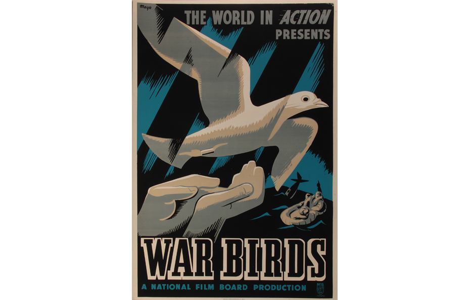
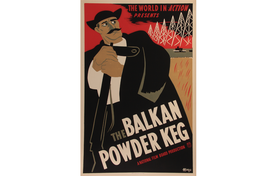
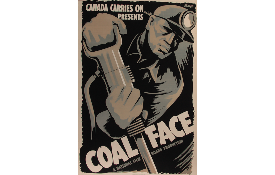
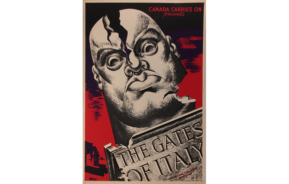
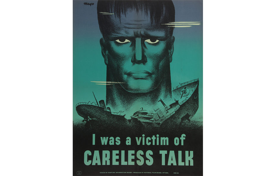
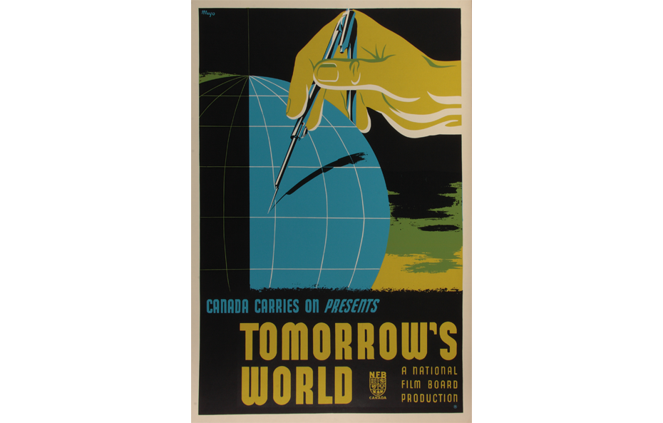
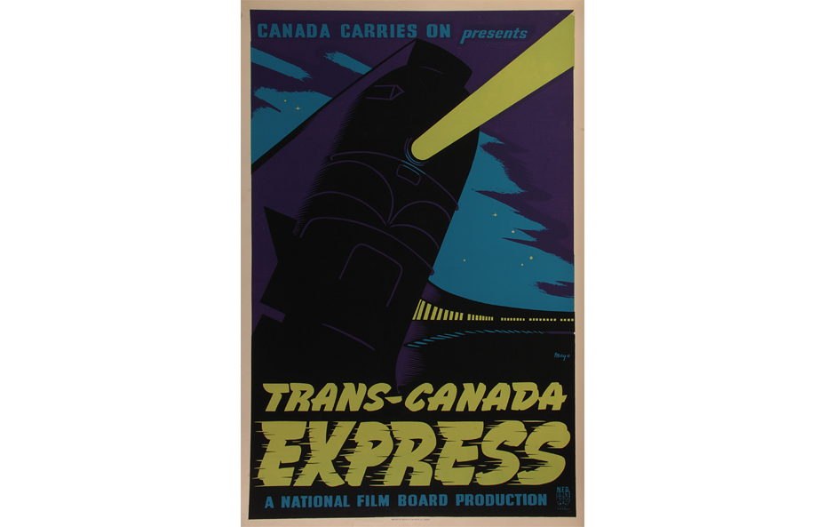
Mayerovitch’s tendency for bold, flat colours and simple lines made his work very dramatic. Having earned a degree in arts and architecture from McGill University and studied wood engraving in Mexico, after the war Mayerovitch returned to practising architecture, still doing painting and cartooning on the side, but did not produce any more posters.
The first modern teachers
By the 1940s, several fine arts institutions provided specialized training in graphic design. In 1945, the School of Art and Design run by the Art Association of Montreal (which became the Montreal Museum of Fine Arts in 1949) offered advertising design classes under the direction of Allan Harrison.
The Institute of Graphic Arts, which opened in 1944, began teaching advertising art in 1946. Henry Eveleigh was an influential instructor in this program.
Harrison and Eveleigh became fierce advocates of a resolutely new, modern form of graphic arts, a departure from the conservative style then dominant in Quebec. With their colleagues Charles Fainmel and Carl Dair, they wrote many publications explaining the principles of advertising design. Their aim was to give the field its proper due, documenting the specific knowledge, techniques and expertise essential to a new, modern practice.
Allan Harrison was born in Montreal in 1911. A student at the École des beaux-arts de Montréal, he then attended the Art Students League in New York City. He taught at the Art Association of Montreal School of Art and Design from 1941 to 1946, at Sir George Williams University (now Concordia) from 1961 to 1966, and at the Université du Québec à Montréal (UQAM) from 1970 to 1972.
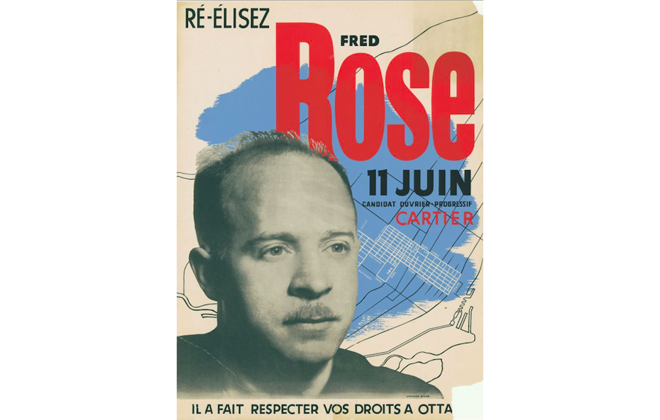
In 1945, he created the campaign poster for the only Communist elected to Canada’s parliament: Fred Rose, in the Cartier riding. Although the large photograph of the candidate is quite conventional, its placement against a stylized map of the neighbourhood and the bold, modern typography were totally new elements compared to the traditional political posters that papered Montreal at the time (and to this day).
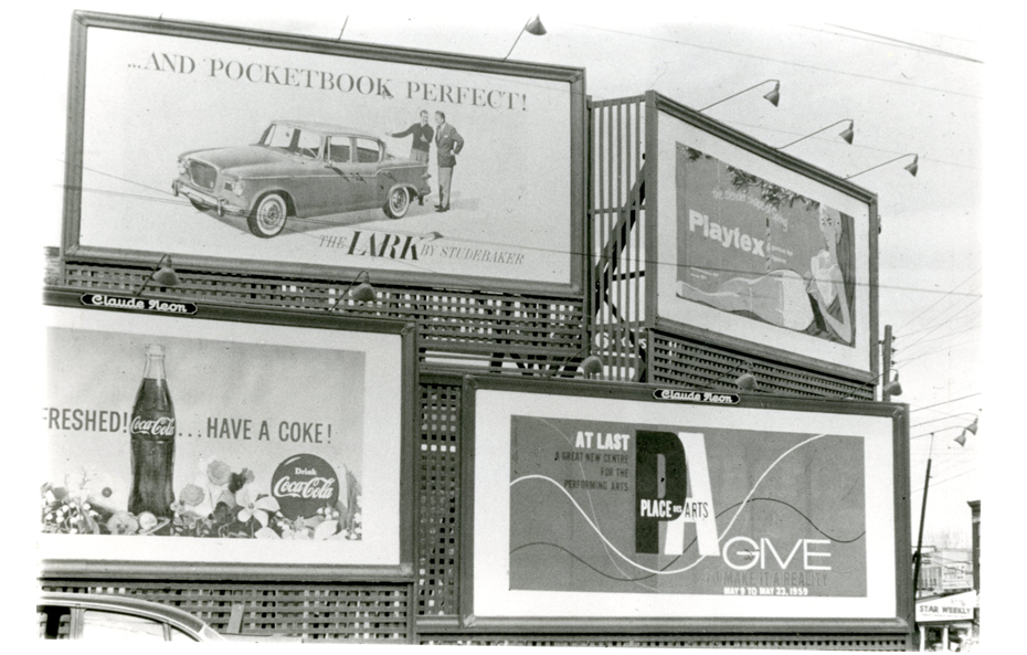
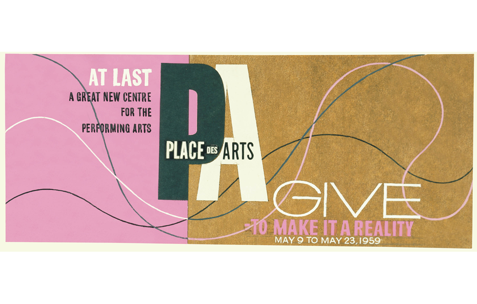
Harrison’s lettering and symbolism in the 1959 fundraising campaign poster for Montreal’s new Place des Arts also stuck out in the urban landscape, as can be seen in its billboard form positioned alongside the usual ad agency productions.
Henry Eveleigh, a British citizen, was born in Shanghai in 1909. After studying at the University of London’s Slade School of Fine Arts, he left to take an internship in Brussels and in 1929 enrolled at the Institut supérieur des Arts décoratifs (known as La Cambre), in Belgium. He moved to Montreal in 1938.
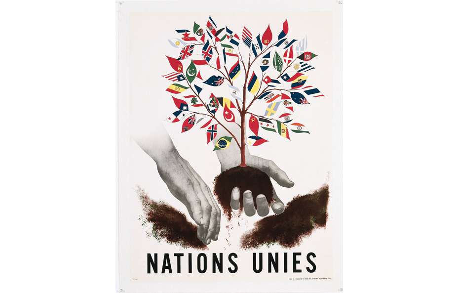
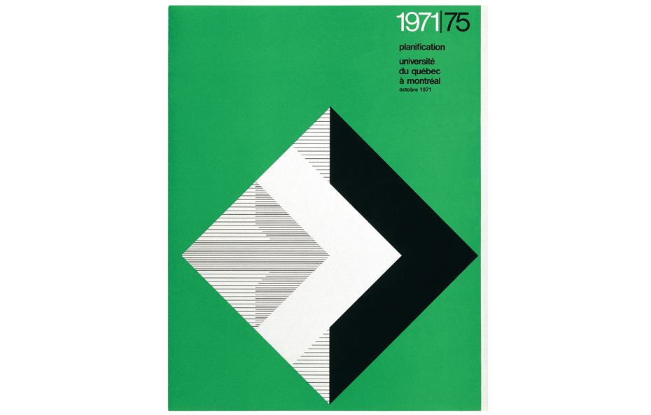
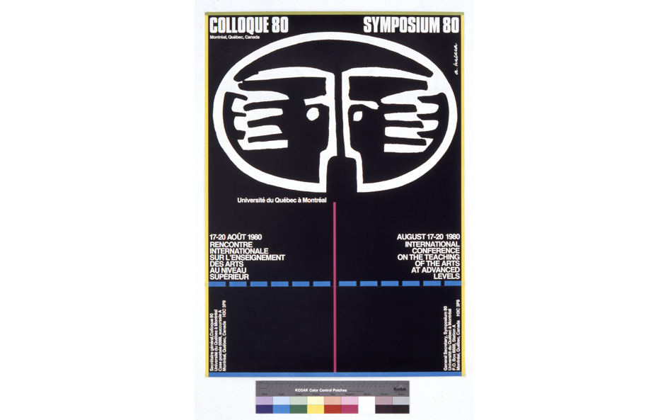
In 1947, his entry in the United Nations’ first international poster contest won First Prize and was reproduced in multiple languages around the world. Also in 1947, Eveleigh helped establish the new advertising design program at the École des beaux-arts de Montréal, which he then headed for 20 years. In 1969, he became the first director of the graphic design program at UQAM, where he taught until 1980.
In late 1967, when the network of general and vocational colleges (CEGEPs) was created, colleges began offering classes in “Graphic Design – Applied Arts.” Students could then continue their post-secondary training in various graphic design programs offered by UQAM, Université Laval, Université du Québec en Outaouais and Concordia University. The profession became organized and the Société des graphistes du Québec was founded in 1974.
The International Style, Expo 67 and the 1976 Olympic Games
In the field of graphic design, the International Style, often referred to, rightly or wrongly, as the “Swiss School,” was dominant, or indeed paramount, from the 1930s to the 1970s. Associated with profound industrial, social and economic changes, the International Style developed in conjunction with increased international trade, particularly in major international specialized journals, and is seen as a symbol of modernity and efficiency.
Among its key elements are formal abstraction, a grid-like approach to layout, a functional aesthetic, the use of photographs, the Futura typeface, created in 1927 by Paul Renner, followed by the Helvetica typeface created by Max Miedinger in 1957.
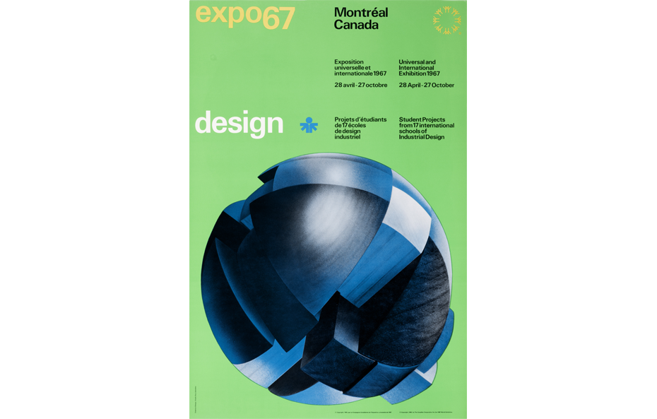
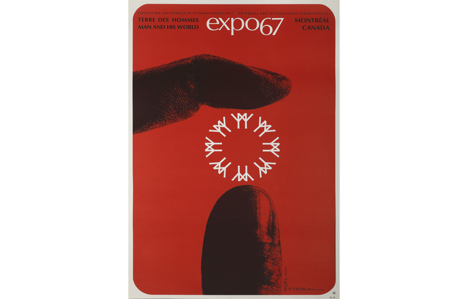
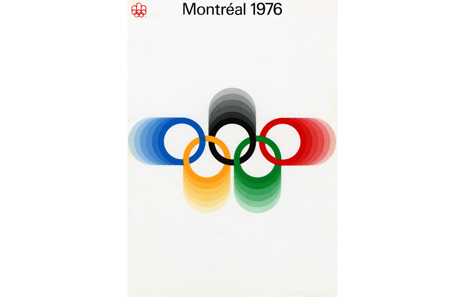
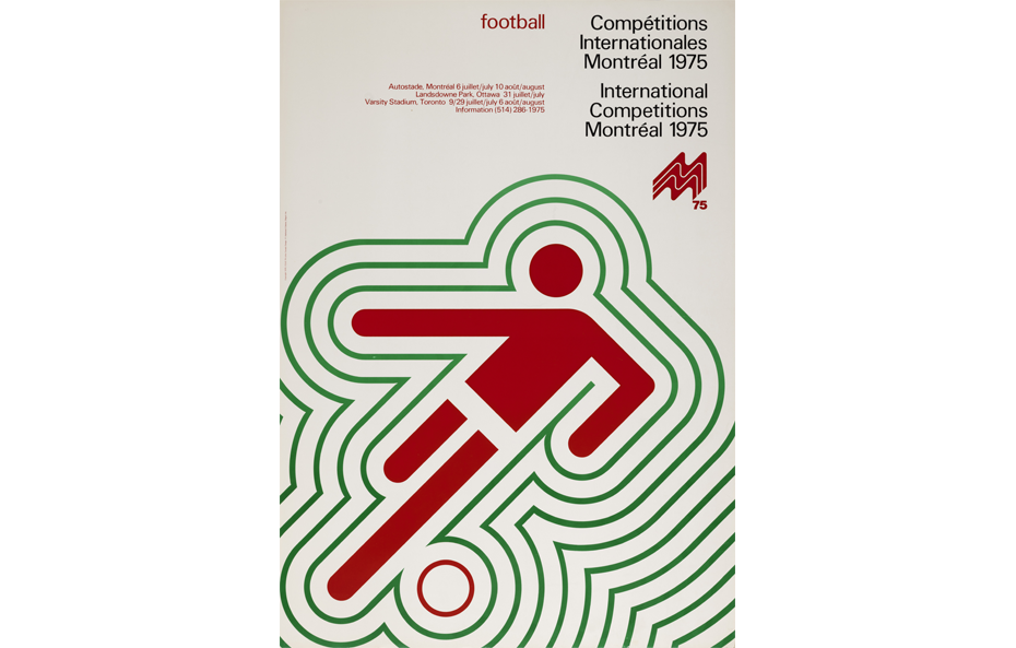
Two major international events—the Universal Exposition of 1967 and the 1976 Olympic Games—were held in Montreal, introducing Quebec to millions of people. A number of graphic designers were hired to produce promotional materials for these events, providing them with an opportunity to showcase their work.
The first graduates of Quebec’s graphic design programs, of whom Gilles Robert, Roger Cabana, Réal Séguin, Georges Beaupré, Raymond Bellemare, Yvon Laroche, Pierre-Yves Pelletier, Georges Huel and Guy Lalumière are the best known, took part in these campaigns. Several young Europeans who immigrated to Canada in the 1950s and 1960s, like Ernst Roch, Rolf Harder and Fritz Gottschalk, were also involved.
| Rolf P. Harder – A Pioneer of Canadian Graphic Design An aficionado of the history of modern graphic design explores the archives of Rolf P. Harder |
Graphic design and the counterculture
In an effort to add illustration, an artisanal touch and some emotion to graphic design, designers began experimenting with new approaches. Pop Art and Op Art, along with a revival of Art Nouveau and Art Deco, informed the graphic designs created for the counterculture movement that developed in the United States and Britain during the 1960s, before spreading around the world.
Two iconoclastic graphic designers and poster artists
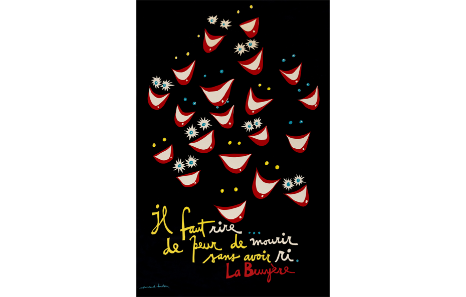
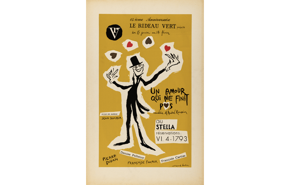
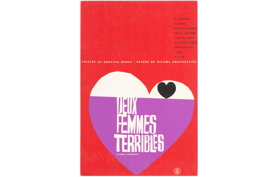
The Montreal theatre scene exploded after the Second World War, and posters were one way to attract public attention. Graphic designers from various backgrounds were asked to create posters, including Montreal cartoonists Robert LaPalme and Normand Hudon, whose playful posters from the late 1950s and early 1960s are now almost forgotten, and Gilles Robert, a 1950 graduate of the School of Graphic Arts.
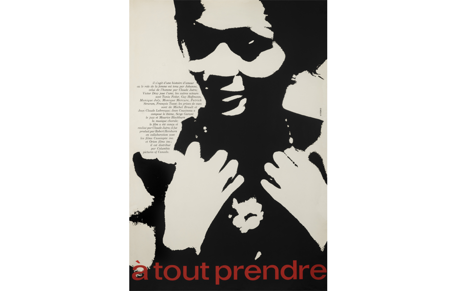
In field of cultural posters, two creations from the 1960s and 1970s stand out in particular. The first was from the legendary, self-taught extrovert, Vittorio Fiorucci, while the second, produced by Gérald Zahnd, who trained in Switzerland in the best schools of the era, is as obscure as its creator.
Vittorio Fiorucci, born in 1932 to Italian parents living in the former Yugoslavia, immigrated to Canada in 1951, where he began a career as a cartoonist and photographer before taking up graphic design, with no formal training in any of these disciplines.
One of Vittorio’s first commissions as a poster designer was in 1963, when he created the poster for the film À tout prendre, by Claude Jutra. His début was as notable as the film itself, and the poster received numerous awards.
In 1964, Vittorio became artistic director of the Montreal International Film Festival and produced several extraordinary posters. He used his torn paper technique and bright, highly contrasted colours to create his images.
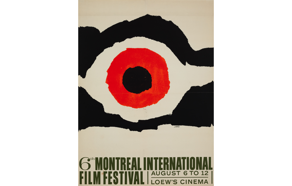
His posters for Confrontation, international sculpture exhibitions held at Place des Arts and the Montreal Botanical Garden, are in the same vein and remarkable for their total abstraction.
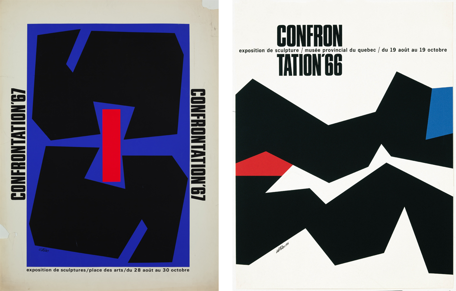
Right: Vittorio, Confrontation ’67, 1967, Marc H. Choko collection, © Vittorio
In the 1970s, Vittorio created posters for productions of the National Arts Centre Theatre Company in Ottawa, including The Killdeer and Don Juan, precursors of his legendary series for the Opéra de Montréal in the late 1980s and early 1990s.
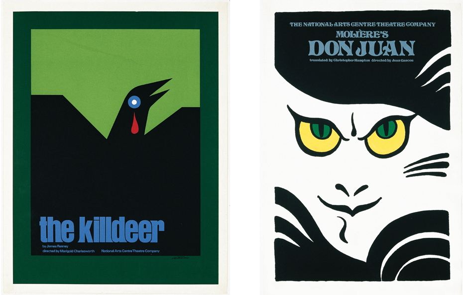
Right: Vittorio, Don Juan, Molière, National Arts Centre, 1977, Marc H. Choko collection, © Vittorio
The most uncelebrated graphic designer and poster artist in the history of Quebec is without doubt Gérald Zahnd. Born in Switzerland in 1941, educated at the School of Fine Arts in Lausanne, then at the École suisse de céramique / École des arts et métiers in Vevey, he moved to Montreal in 1964. Zahnd worked with several architects, creating artworks for public buildings, before beginning his career as a graphic artist. He worked for public organizations, private companies, and in the fields of film and theatre, in particular.
His creations blended reimagined elements of the International Style with original, colourful, playful graphics inspired by the artistic freedom of the counterculture.
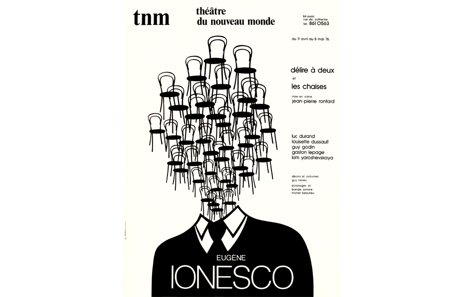
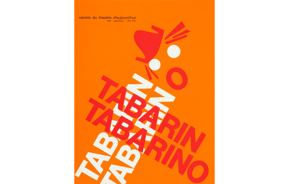
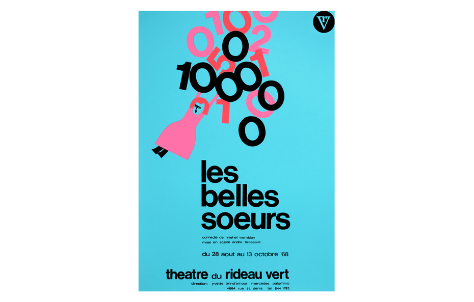
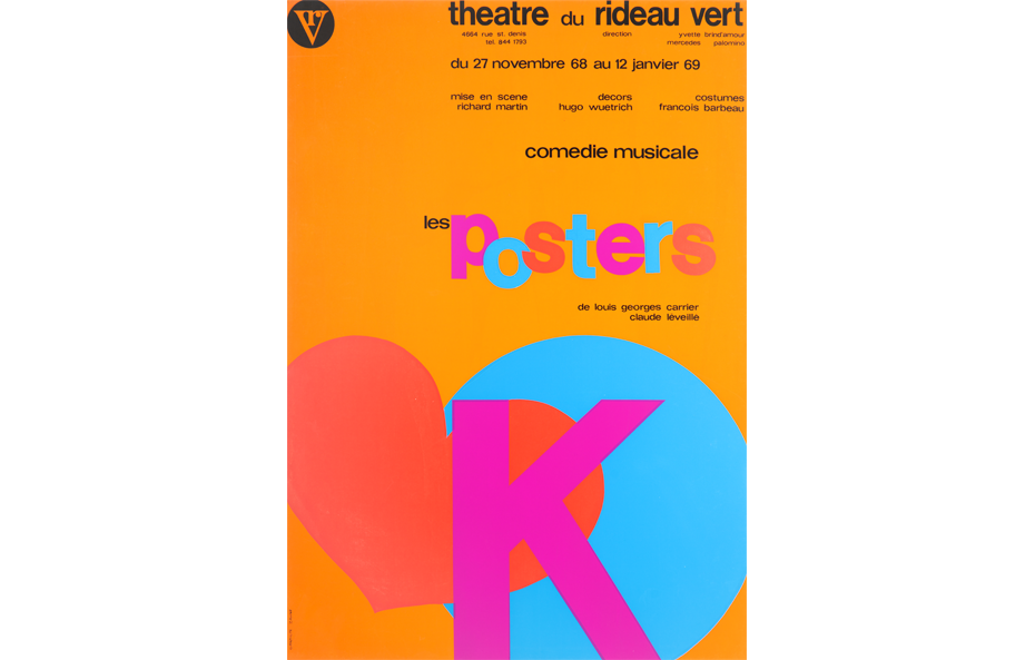
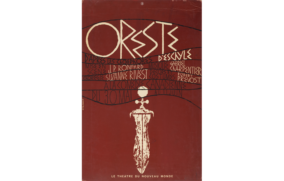
Gérald Zahnd’s long collaboration with the administrations of the Theatre du Rideau Vert and the Théâtre du Nouveau Monde (TNM) was the prime reason for the trust and creative freedom he was given. For some 15 years, he experimented with multiple graphic styles, from the first of his three posters for Les belles soeurs or the one designed for Les posters, two plays at the Theatre du Rideau Vert, to his creations for the plays Eugène Ionesco at the TNM and Tabarin Tabarino at the Theatre d’Aujourd’hui.
The modern poster in Quebec
Contrary to popular belief, the practice of graphic design in Quebec has never been a closed milieu, turned in on itself. As in several other artistic fields, while the modern style may not have been dominant, it did influence Quebec designers long before the late 1960s.
Some graphic designers working in Quebec from the 1930s to the 1970s were products of the old system and received their training from modernists who taught at the Institute of Graphic Arts or at one of the schools of fine arts. Introduced to the field in Quebec, many then pursued their training in Europe or the United States. Others were born and trained outside the country, and then practised in Quebec. Among them, Swiss designer Frédéric Metz, who arrived in 1967, and Polish designer Alfred Halasa, who immigrated in 1976, became pillars of the graphic design program at UQAM, where they taught for some forty years, training many of Quebec’s best known graphic designers.
References
CHOKO, Marc H. Les maîtres de l’affiche en sérigraphie, Suresnes (France), Éditions du Limonaire, 2021, 262 p.
CHOKO, Marc H. Canadian Pacific. Creating a Brand, Building a Nation, Berlin, Callisto Publishers, 2015, 384 p.
CHOKO, Marc H., Paul BOURASSA et Gérald BARIL. Le design au Québec, Montréal, Éditions de l’Homme, 2003, 384 p.
CHOKO, Marc H. L’affiche au Québec, des origines à nos jours, Montréal, Éditions de l’Homme, 2001, 286 p.

See also